Documenting daily activities and important events helps preserve important memories, but remembering to lengthy entries and carrying a notebook and pen are difficult. We were tasked to build a product that allows quick entries and easy printing of beautiful book so users have entries as a keepsake.
A photo journaling app that encourages quick daily interaction so the user can document important events or day to day activities to keep memories for themselves. There is also a book printing feature that allows users to turn their digital entries into beautiful books that can be cherished forever.
RESEARCH
COMPETITIVE ANALYSIS

I began my project researching competitors in the field of journaling apps. I completed a competitive analysis analyzing the strengths and weaknesses of competitors and identities opportunities where my app could differentiate itself.
- Easily print digital journal is beautiful bound book
- Responsive web app - can use computer or phone for entries
- Preformatted pages (edited as you go)
- Easily change design of entries
- Preview entries in calendar view (include pictures that were added)
- Ability to set reminders
- Open app/webpage to current day’s entry
- Easily jump to another date
- Prompts available to get started
USER SURVEYS
I created and deployed a user surveys to identify user attitudes on journaling as well as printed photo books.
- #1 frustration with photo book creation is that they took a very long time to create
- #2 was that it was difficult to get photos from phone onto the service
- 75% of respondents said they would use journal to document travel
- 50% said they would use product to document kids’ progress
- Of respondents who journal, #1 frustration was that they often forget
- Of the respondents who don’t journal, 100% indicated that only needing to write short entries would make them more likely to journal.
Survey Takeaways
USER PERSONAS
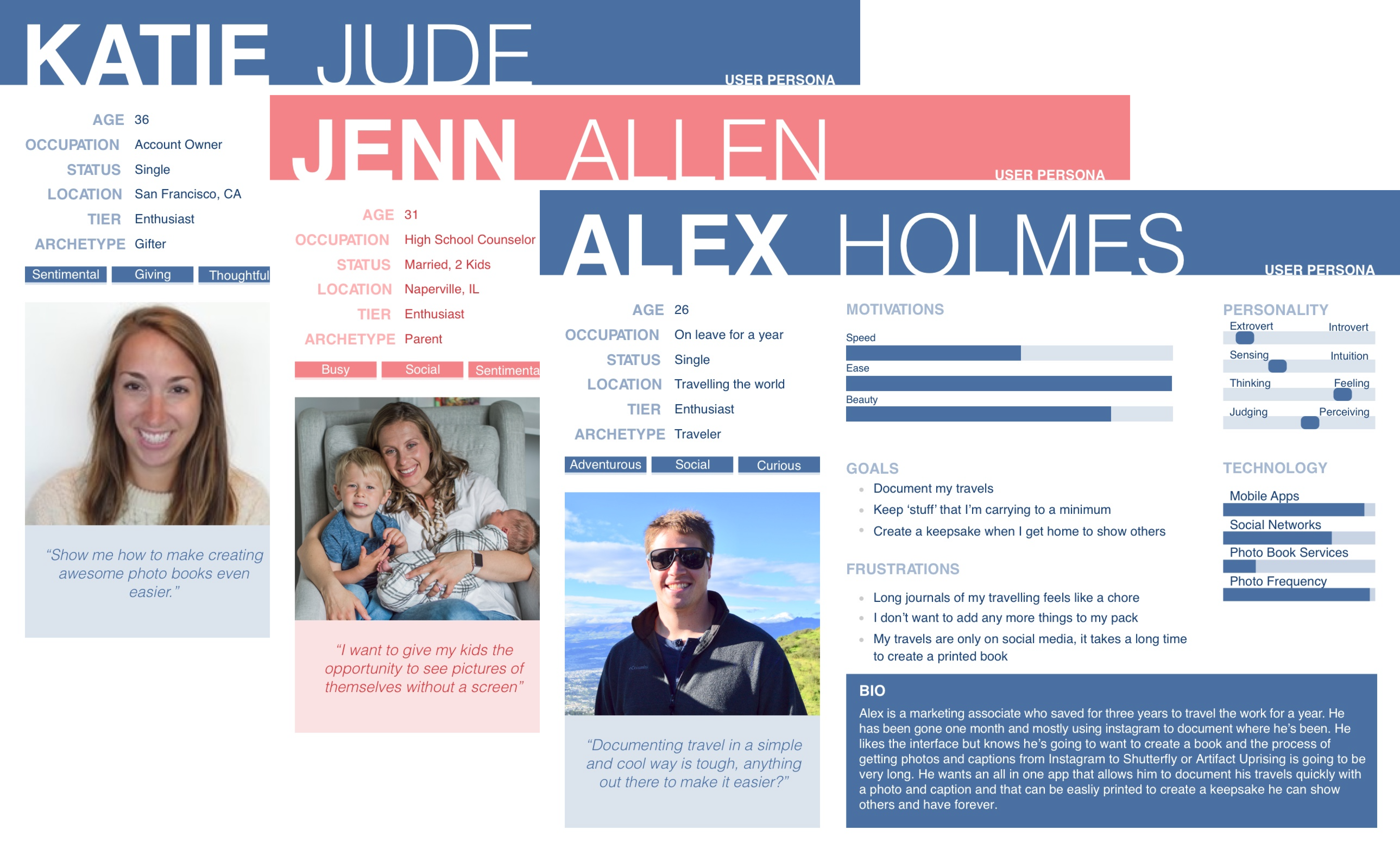
Before I began building the solution, I conducted interviews to get even more information about the needs and frustrations of my users. My biggest takeaway from my user interview was to prioritize ease over volume of content.
USER STORIES
I considered all actions users would want to complete on the app and created user stories for those. Thinking micro about user interactions is important so that I design the solution with a clear idea of what is needed by my users.
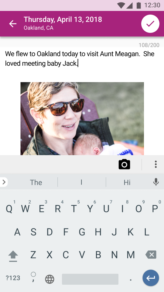
- As a user, I want to create a journal entry
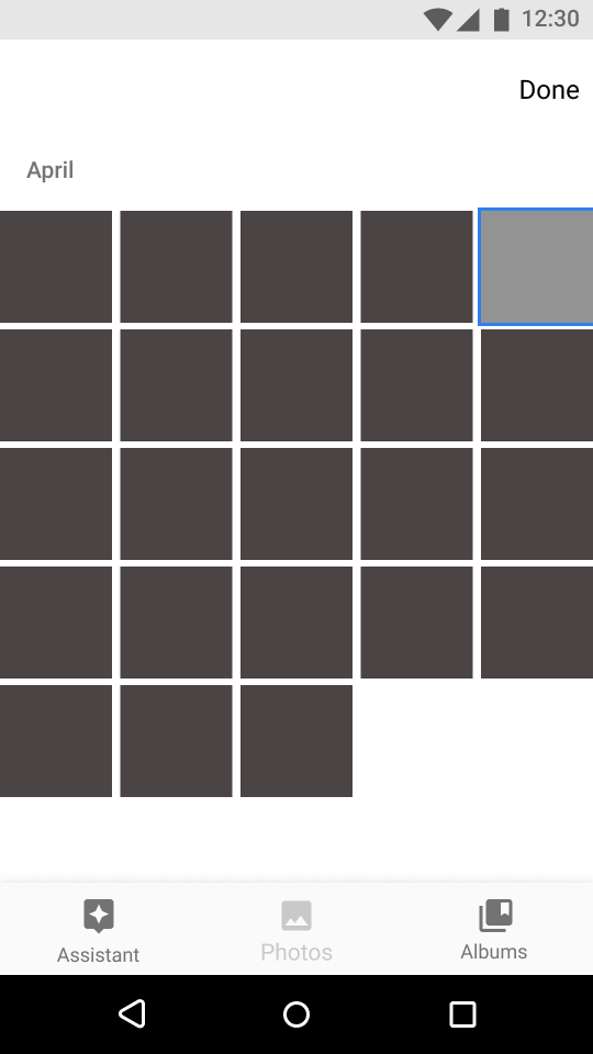
- As a user, I want to add a picture to a journal entry
- As a user, I want to save a journal entry
- As a user, I want to order a bound book
- As a user, I want to preview my entries
USER FLOWS
I next considered HOW my users would complete the high priority user stories by building user flows.
Add a New Entry

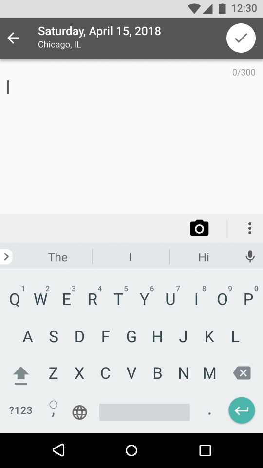
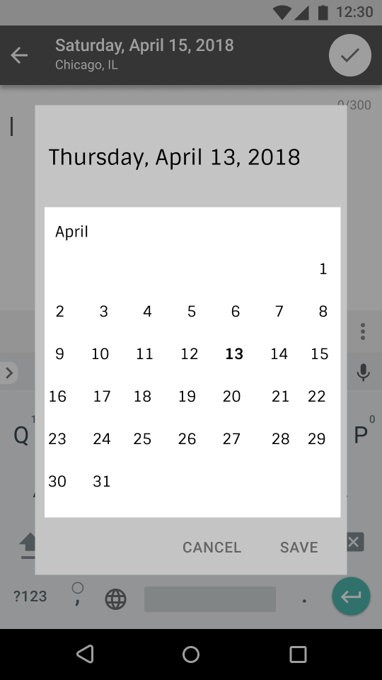
Change the Date of an Entry

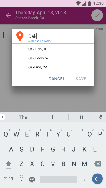
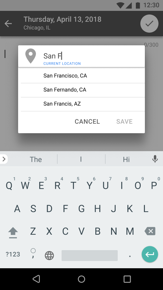
Change the Location of an Entry

Print a Book

BRANDING
BRAINSTORM & SKETCH
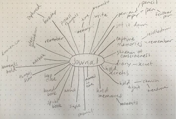
My goal with this project was to create elegant visual design that would appeal to all of my user personas. I wanted it to feel trendy enough for millennial travelers to want to use it, friendly and fun enough for parents to use as a way to track their kids’ growth and approachable and safe enough for users who want to use it to hold and process their feelings. I did a mind map to start my brainstorm.
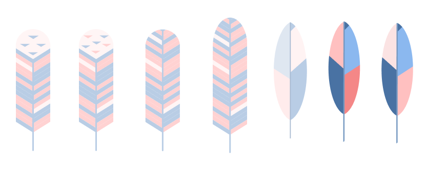
I thought the image of a feather appropriately captured the feel I wanted and hinted at a feather pen, which makes sense as a logo for a journaling app. I had a lot of fun tinkering with the logo in Figma and I used the logo in to build a color scheme.
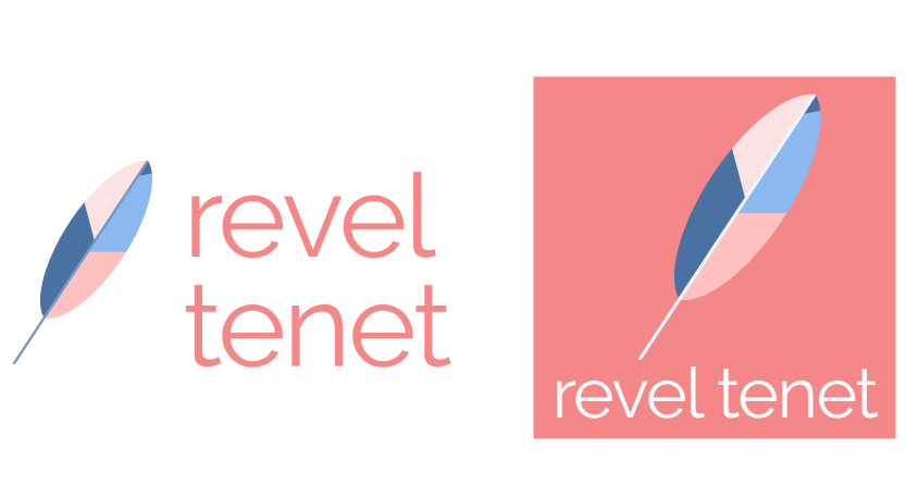
I liked these colors but as I built out the high fidelity mockups, these weren’t the feel I was going for anymore. I wanted something with more pop and that was a little less feminine. I landed on the colors below.
STYLE GUIDE
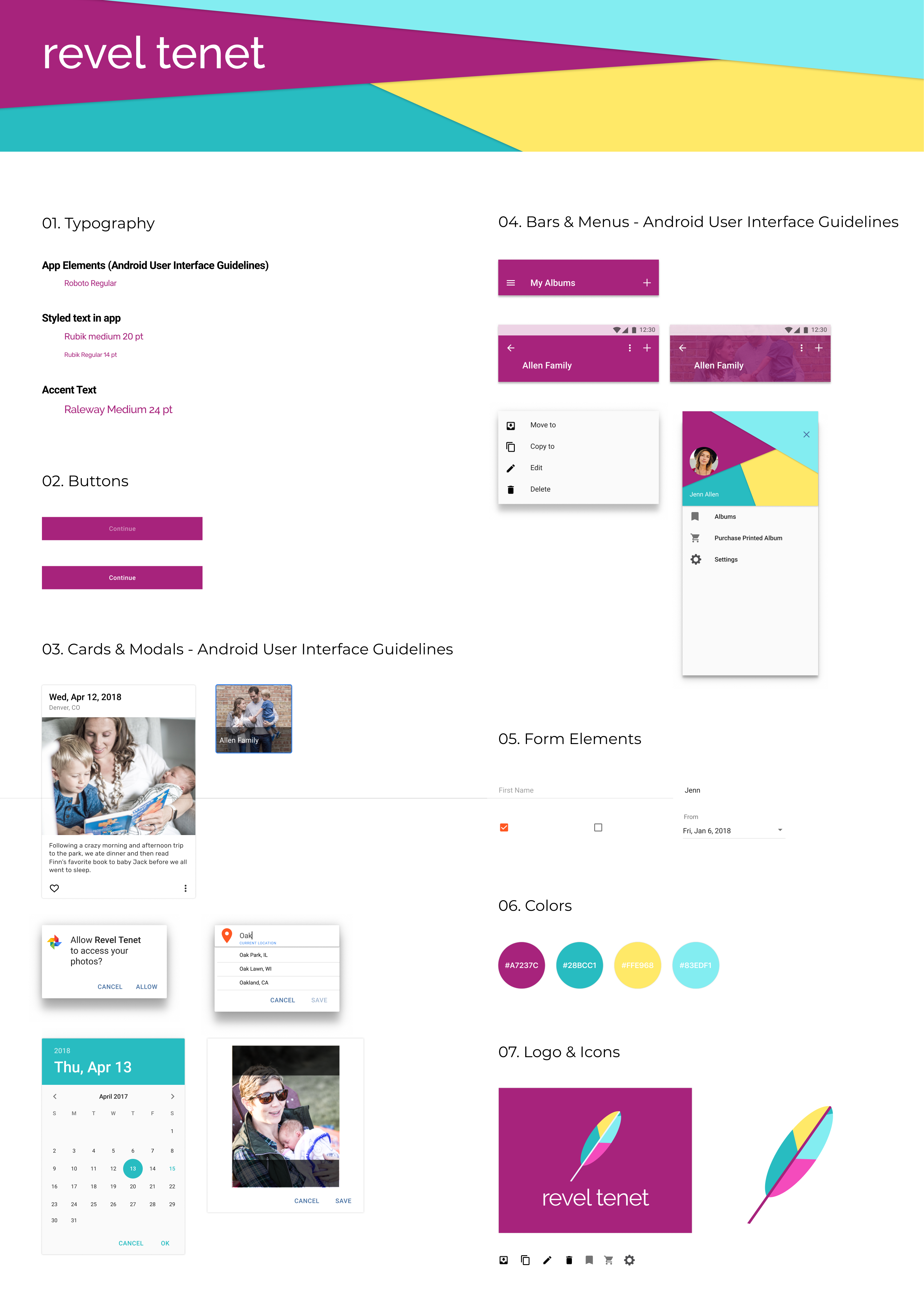
I built out a style guide including the important elements of the app. Because this is an Android app, I used Roboto for the majority of the elements within the app and Rubik for styling app text. I chose to use Raleway as an accent font because it fits in with the trendy/approachability of the rest of the app.
DESIGN
Wireframes
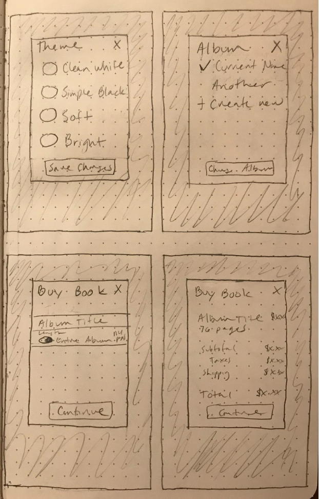
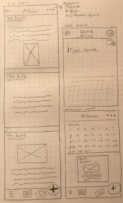
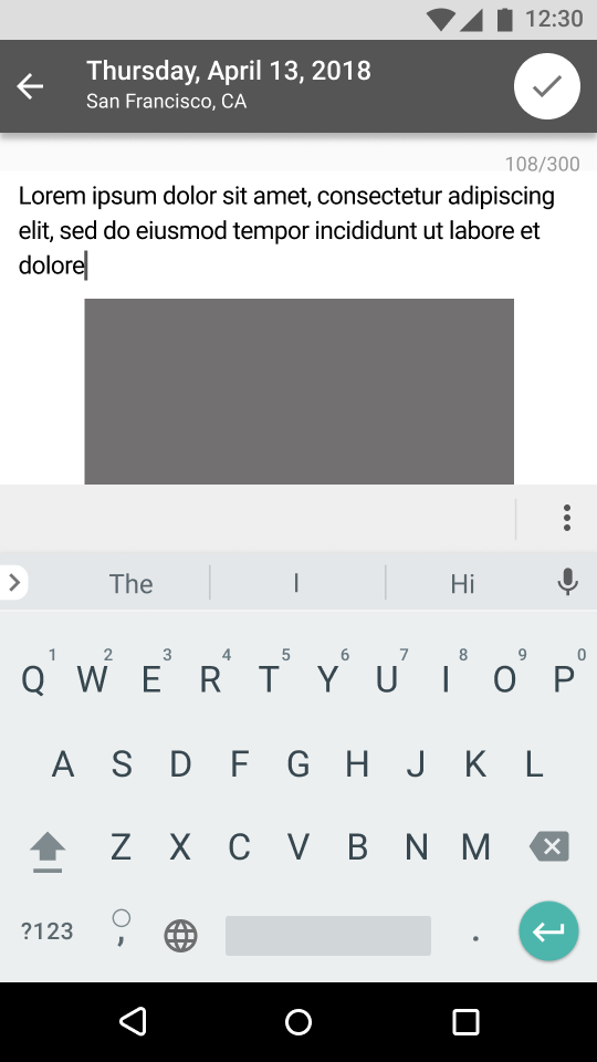
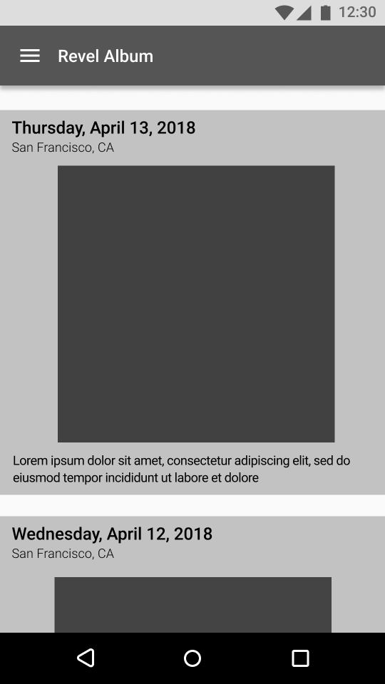
I moved into design starting with wireframes. First, I build sketched a round on paper and then used figma to build a low fidelty prototype so I could begin testing and getting feedback.
PROTOTYPE & USER TESTING
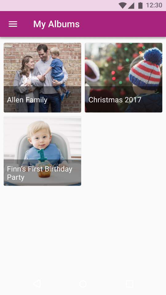
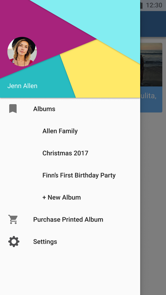
With a strong solution mapped through wireframes and a clear direction for the brand, I built high fidelity mockups. I used invision to build a prototype and test the app with students and teachers.
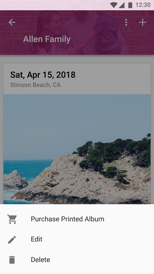
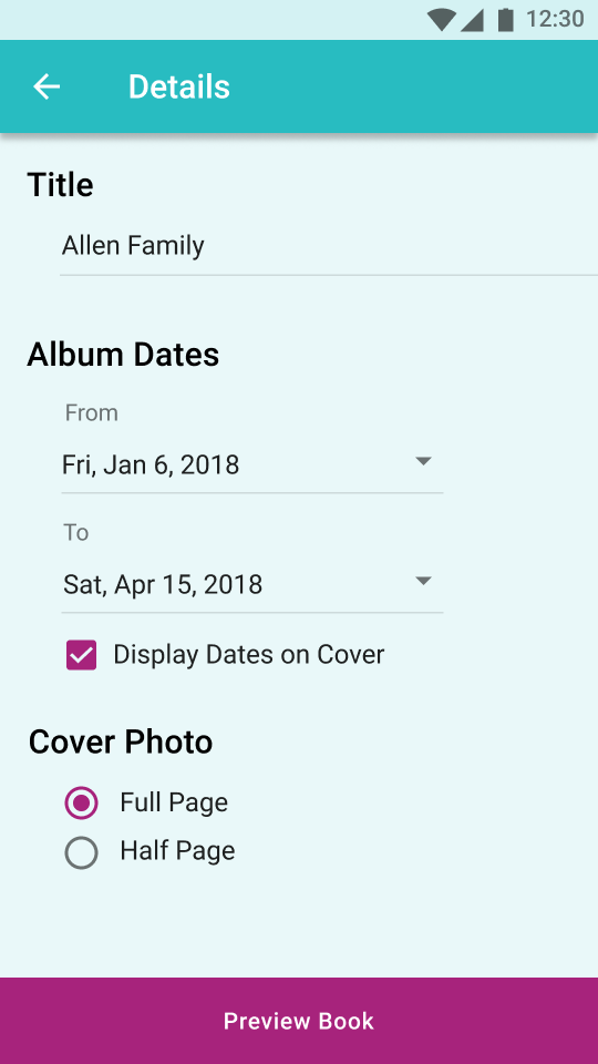
- I want to be able to purchase a printed album without having to go back to the menu page.
- I added the ability to order a printed book within the album page.
Feedback
Solution

- In the original design, all images had to be cropped to the same size. Users wanted more control over the photo cropping.
- Changed the card design to allow varying image sizes.
Feedback
Solution


HIGH FIDELITY MOCKUP
Taking user feedback into account, I built the final version of Pigeon Planner.
